Your Custom Text Here
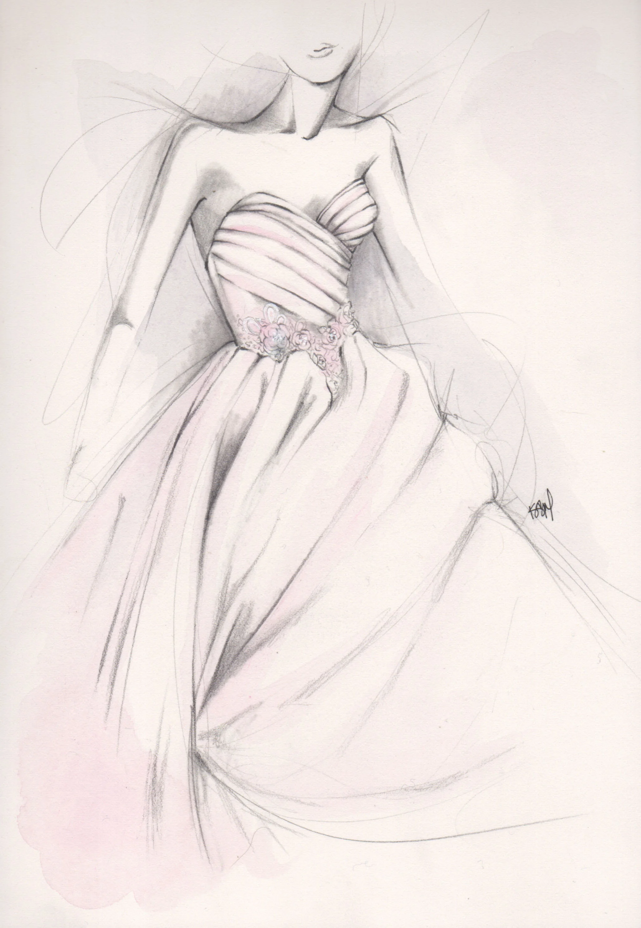

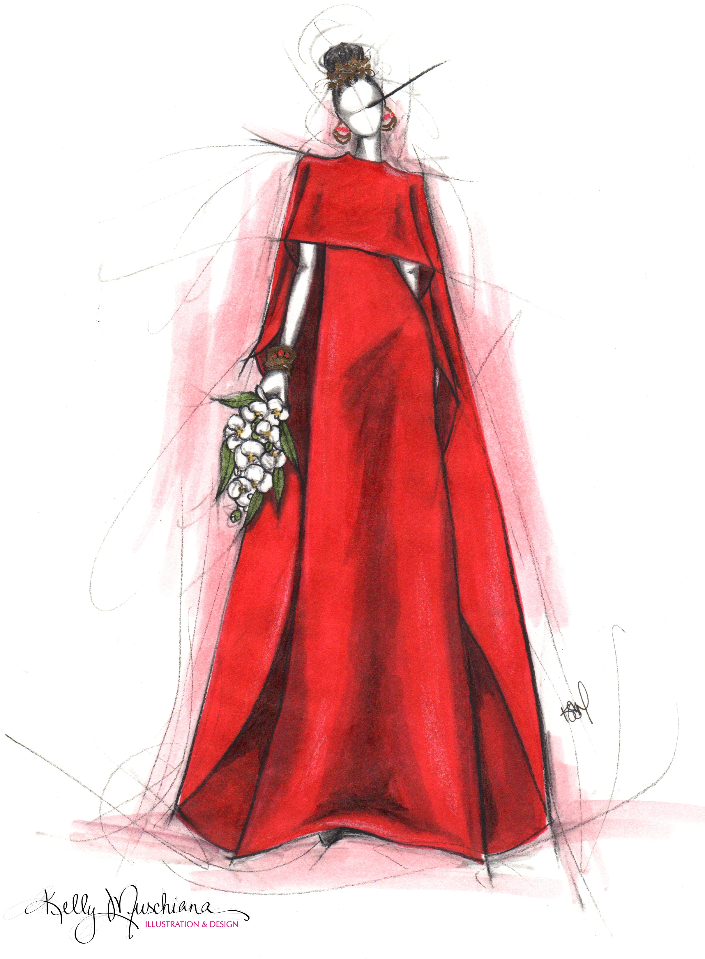
Today's illustration was inspired by a gorgeous spread in Martha Stewart Weddings, dripping with dramatic deep red flowers. The beautifully structured gown featuring a knotted bow at the waist is by Katie Ermilio.
Red is probably my favorite color, I'm loving all of the anything-but-traditional wedding gowns I'm seeing lately and Valentine's Day happens to be just around the corner. Blend that all together and the house of Valentino is the first to come to mind. Once I spied this mesmerizing Resort 2016 gown, my search for a dramatic red wedding gown to illustrate ended. Scroll to the bottom to see the finished piece!
“There is a shade of red for every woman.”

Valentino Resort 2016 photo from vogue.com
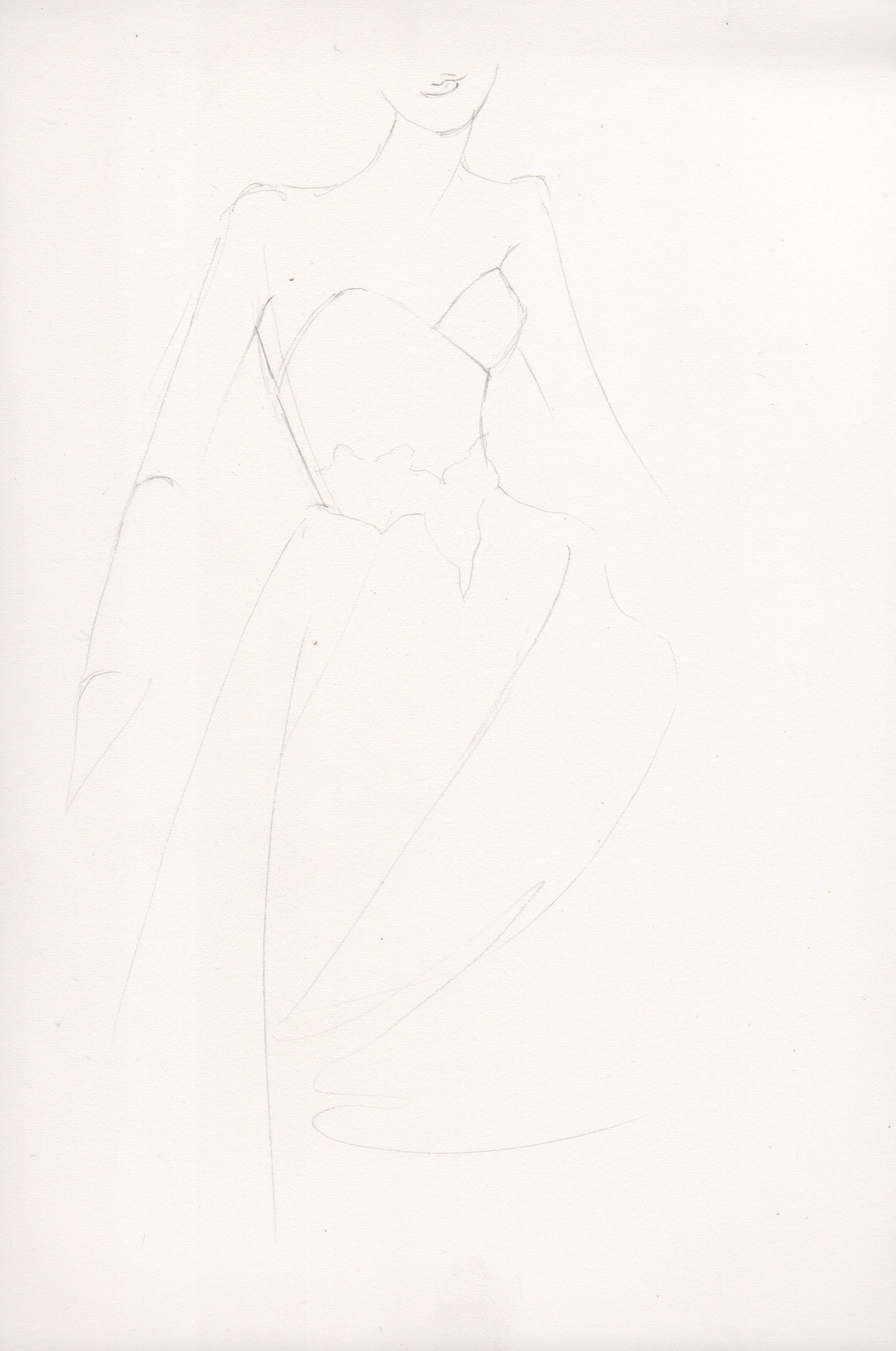
For this illustration I chose to use markers to achieve more vibrant colors. Here is a peak into my process.
Tools: Prismacolor and Copic are my go-to markers. For this illustration I chose Prismacolor. I also almost always use Bienfang Graphics 360 Marker Paper. Markers + colorless Blender + marker paper = life changing.
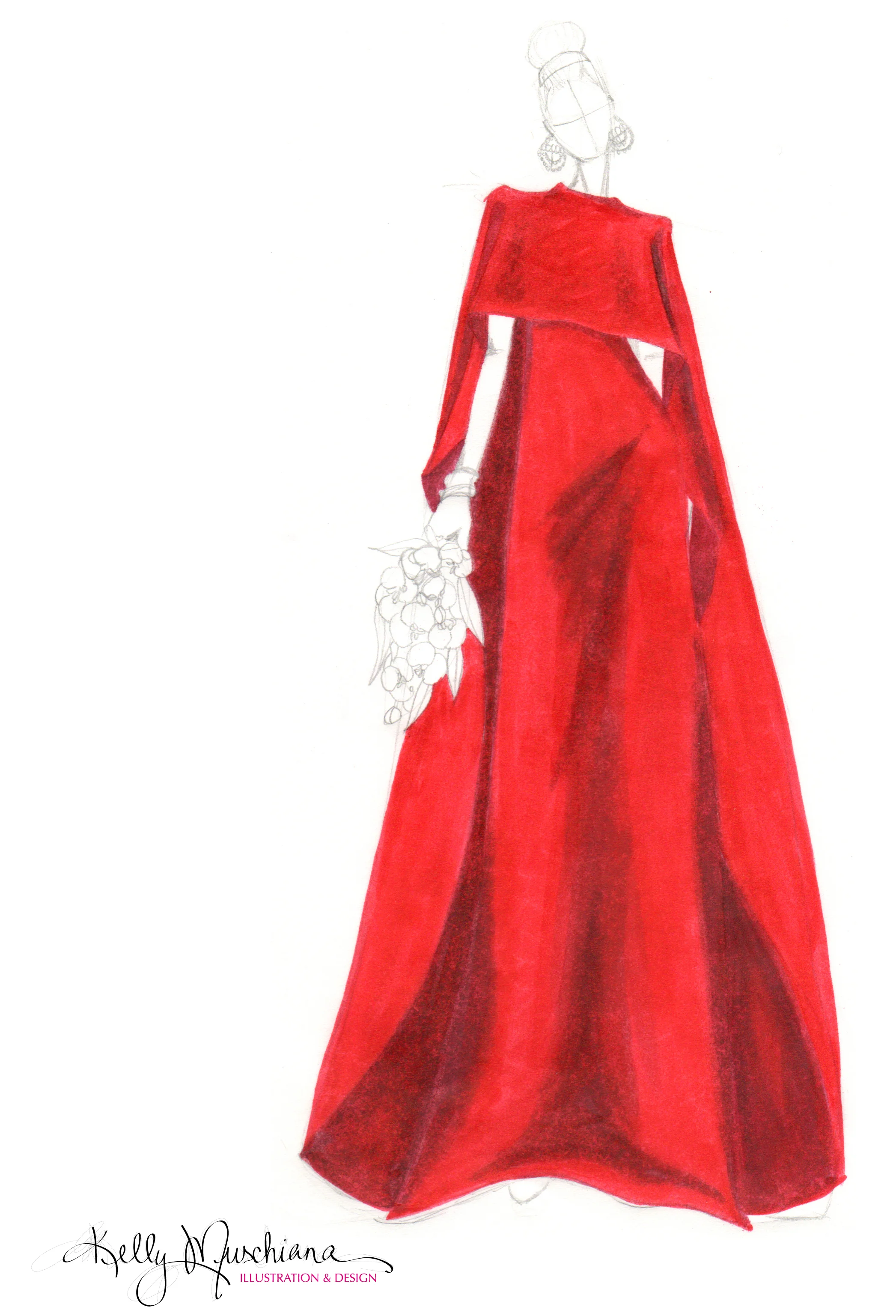
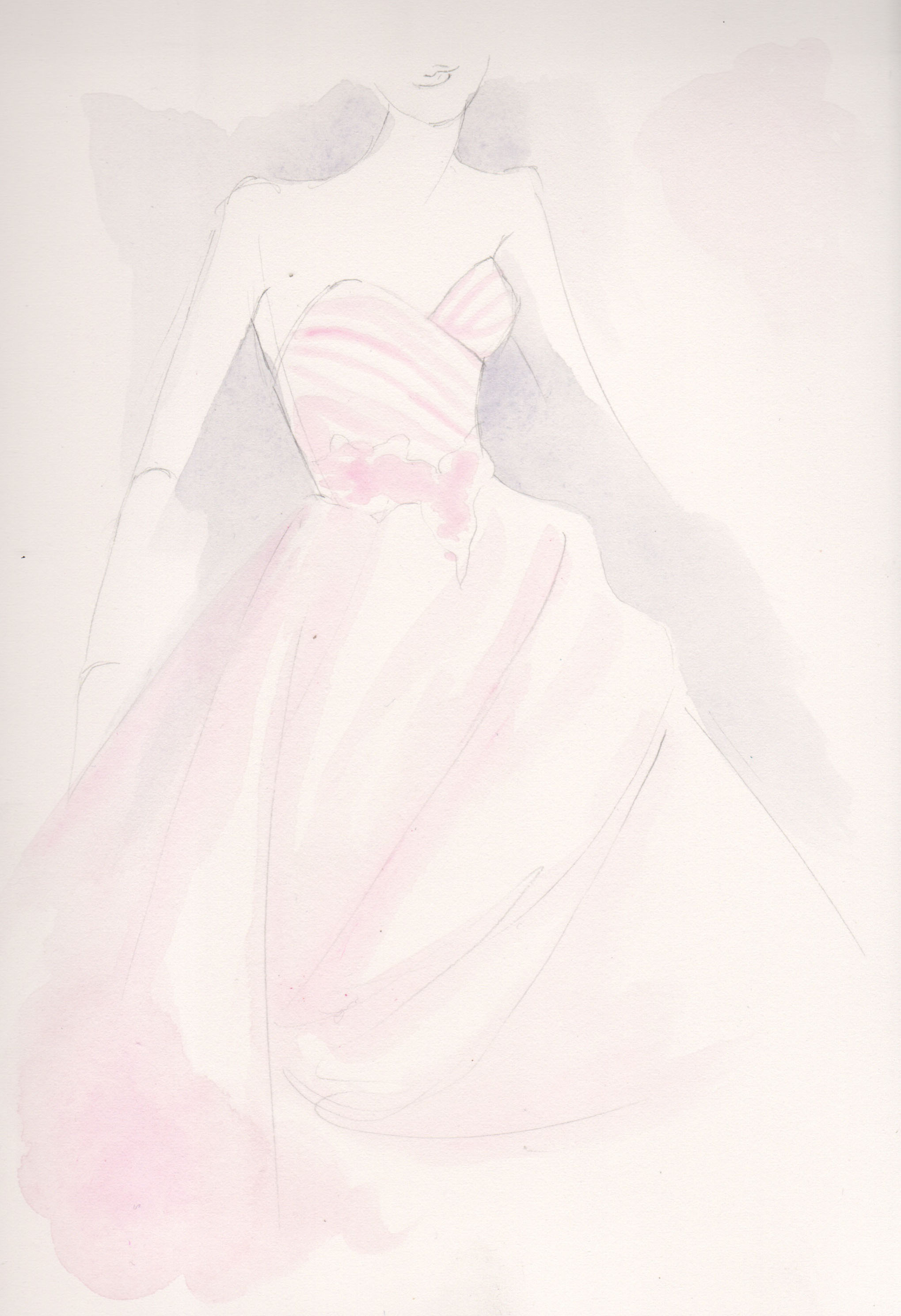
STEP 1: After the pencil sketch is done I lay down a base color. For this dress I used straight up red as my base color because I knew I'd only go darker from there. When using a softer color for a garment I will usually start with the lightest color (white being the highlight) and go darker from there. Next I used Tuscan Red to start the shaded areas and put Raspberry on top of that. I like to build up color with markers much like I do with paint.
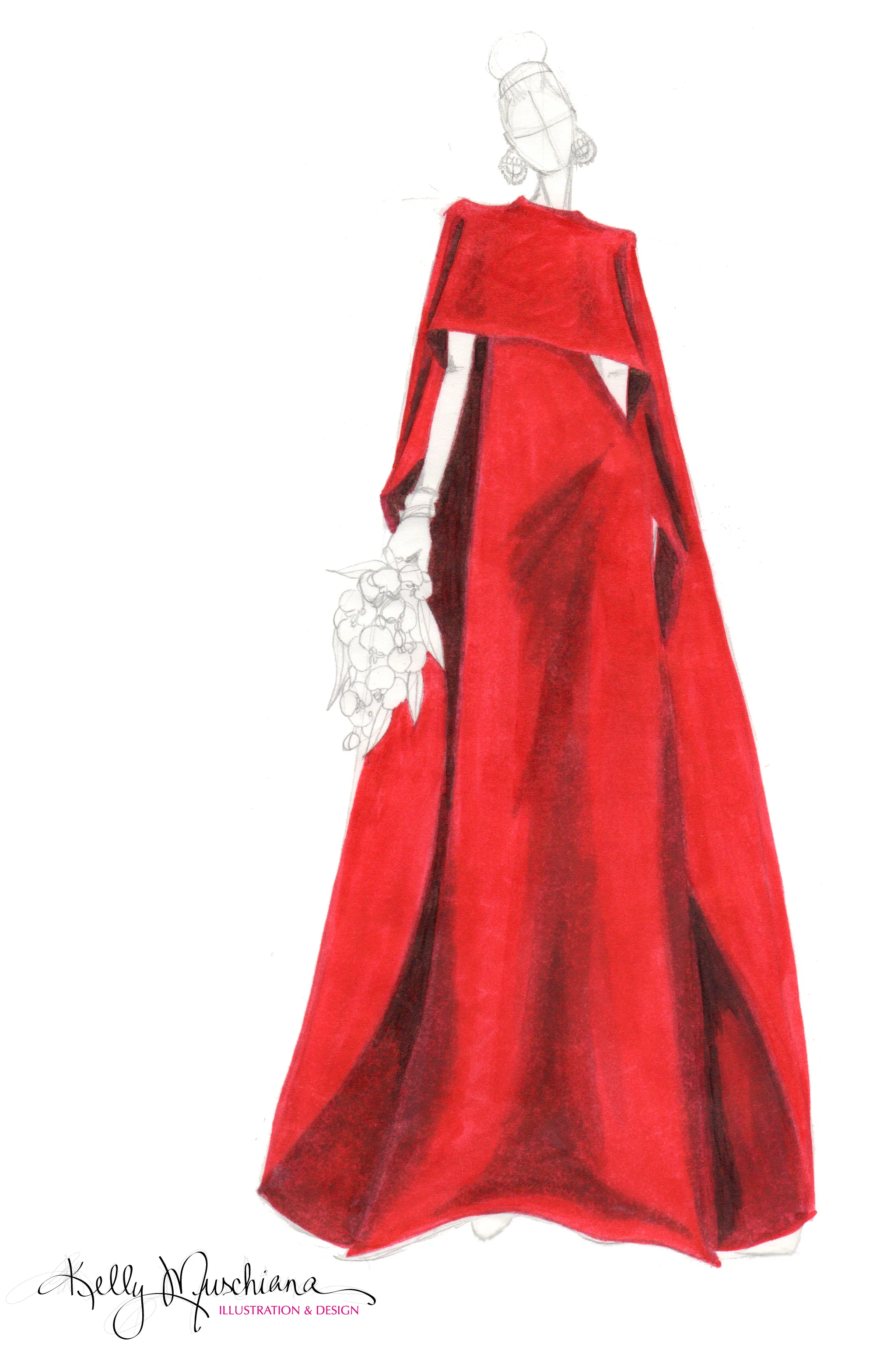
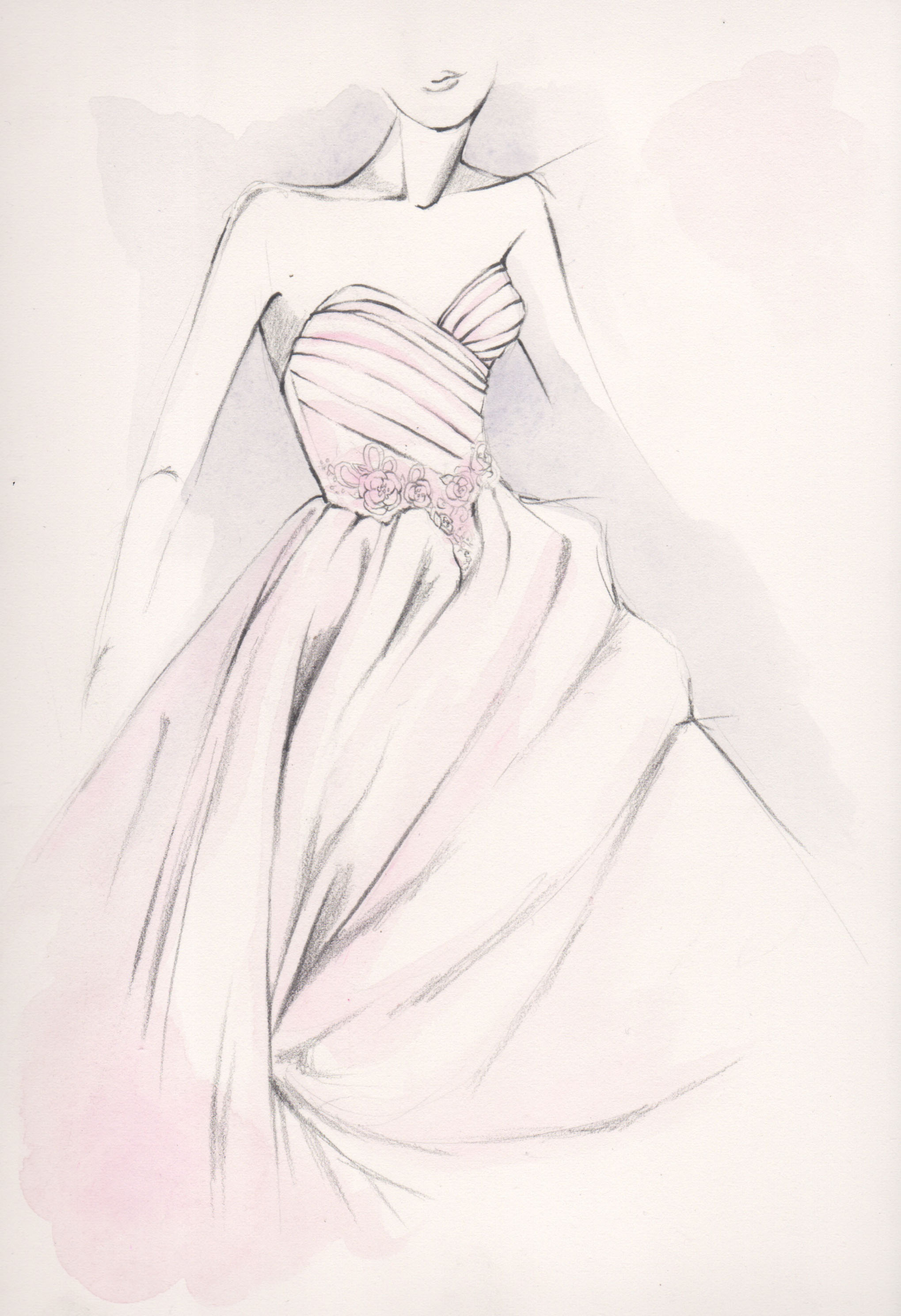
STEP 2: For vibrant colors like red I really like to use complimentary colors for the darkest shadows, staying away from pure black so it doesn't look muddy. Dark Olive was my pick. Mixing complimentary colors (red's complimentary is green) together neutralizes the color. I love this trick! Notice the darker areas of the illustration above and you will see the green. TIP: If you have a big jump between tones, the colorless blender should be your new BFF.
STEP 3: Do you like colors that really pop off of the paper? Then you will love this trick. I turn my paper over and use my base color to color in every single drop of the garment. This sounds crazy, I know, but trust me on this. Besides blending, this is the other reason I adore marker paper. The slight transparency allows for the color on the front of the page to marry the color on the back.
STEP 4: Lastly I apply the background color, the details and shade the figure. TIP: When applying a background color try to pick something subtle if your garment is loud. If your garment is soft maybe choose something the will make it pop. Fashion illustration is all about glorifying the garment...everything else in the image is meant to give it life.